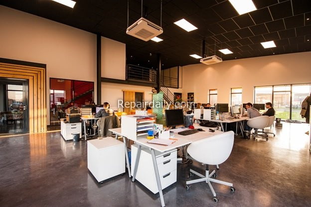
We all know that colour and esthetics have a significant impact on people’s moods and energies. It’s the reason that many modern offices are almost indistinguishable from cafés where everyone is hanging out with their laptops open.
Whether you have a gaming room, lounge area or none of the above in your workspace, having a comfortable, welcoming atmosphere that’s conducive to productivity and creativity is vital to your success. So choosing the right colours to paint your walls, ceilings, floors, etc., is a crucial decision, as it’s often the colours of a space that dictate its vibe and how it’s used.
Before recommending paint colours for an office, it’s best to go over what not to do to help you avoid making expensive mistakes.

Office Painting Mistakes – What Not to Do
The flip side of having colours that can subtly increase productivity or have a calming effect is that choosing the wrong colours or design choices can create a negative work environment that drains energy from your team.
Avoid these mistakes when painting your workspace:
- Doing it yourself. You may be good with a paintbrush or have an eye for style, but walls painted by commercial painting contractors are flawless and perfectly finished. When homeowners and business owners paint their homes and workspaces, they usually make several mistakes. You might think they’re not noticeable, but your employees work there for several hours every day and probably will notice and have to see them every day.
- Buying your own paint. If you found a paint colour you really love, it’s still a good idea to get the advice of a professional on how a paint colour will appear in the lighting in your space. The exception is if you’ve used the same colour in that space before and like how it looked.
- Leaving or painting your office walls white. White walls can give your office an austere, unwelcoming look and feel. You want your team to look forward to coming to work, not feel like they’re being punished.
With that being said, these are some of the colours recommended for workspaces and their effects on people.
Blue
Blues are commonly used in businesses and work environments because it stimulates the mind in a way that can trigger focus and productivity.
Green
Green reminds us of nature, is easy on the eyes and can have a soothing effect. Green is an ideal choice for high-intensity jobs and those where employees work long hours.
Red
Red is known to have an energizing effect on people and is often used in places made for physical activity, like gyms. However, red is sometimes used strategically in office spaces to help keep workers energized.
Yellow
Yellow can help brighten and elevate moods, and is known for inspiring creativity. Marketing agencies and artist collectives often incorporate yellow in their space. Red and yellow are relatively close together on the colour wheel, which is why they can cause similar effects.
